Are you looking to elevate your home decor from simple to stunning? The key to a visually appealing and harmonious space lies in understanding and applying color theory. This powerful design tool allows you to create moods, highlight architectural details, and transform the overall ambiance of your home. Learning how to use color theory in home design can make all the difference between a cohesive, impactful aesthetic and a disjointed, uninspired look. Whether you’re embarking on a full-scale renovation or simply refreshing a room, understanding the principles of color will empower you to make informed decisions and achieve the desired effect.
This comprehensive guide will delve into the core concepts of color theory, exploring the color wheel, color harmonies (including complementary, analogous, triadic, and monochromatic schemes), and the impact of color temperature (warm vs. cool). We will provide practical tips and actionable advice on how to select color palettes for different rooms and purposes, taking into account factors such as natural lighting, room size, and desired mood. Discover how to use color to create a sense of calm in a bedroom, stimulate creativity in a home office, or encourage conversation in a living area. Unlock the potential of color and transform your home into a reflection of your personal style and taste.
What Is Color Theory?
Color theory is a set of guiding principles that explain how colors mix, match, and create different visual effects. It provides a framework for understanding how colors relate to one another and how they can be used effectively in various applications, including design.
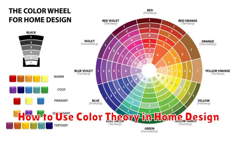
At its core, color theory revolves around the color wheel, a visual representation of colors arranged according to their relationships. The traditional color wheel is based on the three primary colors: red, yellow, and blue. From these primaries, all other colors are derived.
Understanding color theory allows you to create harmonious color palettes, evoke specific moods, and create visual impact. By learning the basics of color relationships, you can confidently choose colors that complement each other and achieve your desired aesthetic.
Warm vs Cool Colors
Understanding the difference between warm and cool colors is fundamental to successful color theory application in home design. Warm colors evoke feelings of comfort, energy, and excitement. They are typically associated with fire and sunlight.
Cool colors, on the other hand, promote a sense of calmness, serenity, and relaxation. These colors are often associated with water and sky.
Key Differences:
| Feature | Warm Colors | Cool Colors |
|---|---|---|
| Hue | Reds, oranges, yellows | Blues, greens, purples |
| Psychological Effect | Stimulating, cozy | Calming, refreshing |
| Visual Impact | Advances, appears closer | Recedes, appears farther |
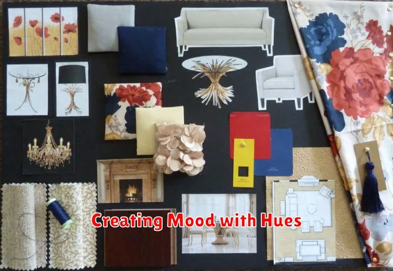
Creating Mood with Hues

Color evokes powerful emotional responses, influencing the overall atmosphere of a space. Understanding these associations is key to creating the desired mood in your home.
Warm hues, such as reds, oranges, and yellows, tend to stimulate energy and excitement. These are ideal for social spaces like dining rooms and living rooms, fostering a sense of warmth and vibrancy. However, overuse can be overwhelming, so balance is crucial.
Cool hues, including blues, greens, and purples, promote relaxation and tranquility. Consider these colors for bedrooms, bathrooms, and home offices to create a calming and peaceful environment. They can make a space feel larger and more airy.
Neutral hues like white, gray, beige, and brown provide a versatile backdrop. They offer a sense of stability and can be easily combined with other colors. Consider incorporating different shades and textures of neutrals to add depth and prevent monotony.
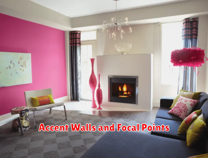
Accent Walls and Focal Points

Accent walls and focal points are powerful tools when wielding color theory in interior design. They direct the eye and create visual interest within a space. An accent wall, painted or wallpapered in a contrasting color or pattern, instantly adds depth and personality.
When choosing a color for an accent wall, consider the existing color palette of the room. You can use a complementary color for a bold, dynamic look, or a shade or tint within the same color family for a more subtle effect.
Focal points, created through the strategic use of color, can highlight architectural features or draw attention to a particular area. A fireplace, a piece of artwork, or a built-in bookshelf can become a focal point with a carefully chosen paint color or decorative elements.
Consider the mood you want to evoke. Brighter, warmer colors create energy, while cooler, muted tones encourage relaxation. By understanding how colors interact and influence perception, you can use accent walls and focal points to create a cohesive and impactful design.
Balancing Tones and Saturation
Tone refers to the lightness or darkness of a color, often manipulated by adding white (tint), gray (tone), or black (shade). A balanced color scheme utilizes a variety of tones to prevent monotony and create visual interest. Too many light tones can feel washed out, while an overabundance of dark tones can feel oppressive.
Saturation, on the other hand, describes a color’s intensity or purity. Highly saturated colors are vibrant and energetic, while low-saturation colors appear muted and calming. Like tone, varying saturation levels is crucial. A room with only highly saturated colors can feel overwhelming, while a space exclusively using desaturated colors might lack vibrancy.
Consider using a dominant color in a few different tones and saturations. This creates a cohesive yet dynamic look. Accent colors can introduce higher saturation or contrasting tones for visual punctuation.
Monochromatic vs Complementary Schemes

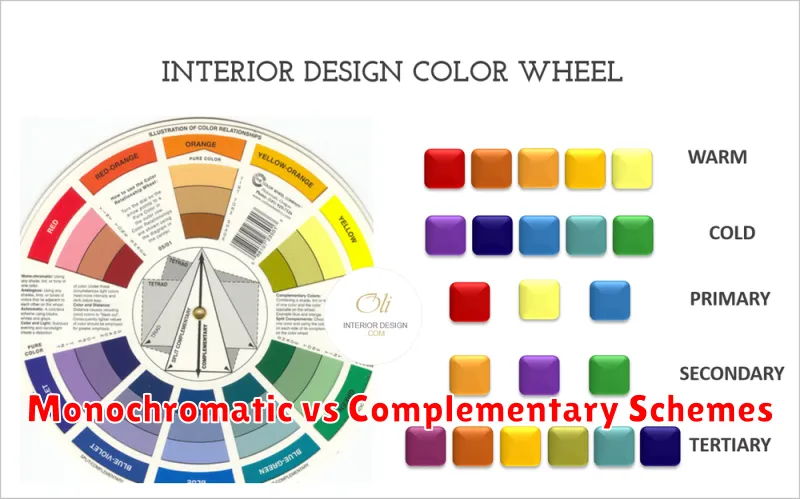
Understanding the difference between monochromatic and complementary color schemes is crucial for creating a harmonious home design. Monochromatic schemes utilize variations of a single hue. This involves incorporating tints, tones, and shades of the chosen color, resulting in a cohesive and calming aesthetic. A monochromatic scheme offers a simple yet elegant approach, minimizing visual clutter.
Complementary schemes, on the other hand, involve using colors opposite each other on the color wheel. This creates a vibrant and energetic feel, as the colors naturally contrast and enhance each other. While visually striking, complementary schemes require careful balancing to avoid overwhelming the space. Use one color as the dominant shade and the other as an accent to achieve a harmonious contrast.
Color Flow Between Rooms
Creating a harmonious color flow throughout your home is essential for a cohesive and aesthetically pleasing design. Adjacent rooms should have colors that complement each other, avoiding jarring transitions. Consider the visual connection between spaces. Rooms that are visible from one another should have color palettes that work in harmony, even if they aren’t identical.
You can achieve color flow through several methods:
- Shared dominant color: Use a dominant color throughout the main living areas, varying the shades and accents in individual rooms.
- Harmonizing color schemes: Employ analogous or complementary color schemes across connecting rooms.
- Transitional spaces: Use hallways and landings as bridges between color palettes, incorporating elements from both adjoining rooms.
Neutral hallways can help separate more distinct color schemes, providing a visual break.

